Large Font Smartwatch Montréal | Easy to Read
2025-10-07

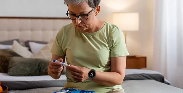
A large font smartwatch in Montréal is a device specifically designed to be easy to read, providing seniors with a clear and accessible way to engage with modern technology. In a city as visually rich and culturally diverse as Montréal, clarity is paramount. For older adults, a smartwatch with a large, legible display is not just a convenience; it is the foundation of a confident user experience. It transforms a potentially complicated gadget into a simple, stress-free tool for communication, health monitoring, and safety. This guide delves into the critical importance of readability and how it empowers Montréal seniors to embrace wearable technology with ease.
The Critical Importance of Readability in Wearable Tech
The effectiveness of any smartwatch hinges on the user's ability to understand the information it presents. For seniors, readability is the single most important factor in determining whether a device will be a helpful companion or a source of frustration. A design that prioritizes large, clear text addresses fundamental user needs directly.
Addressing Age-Related Vision Changes
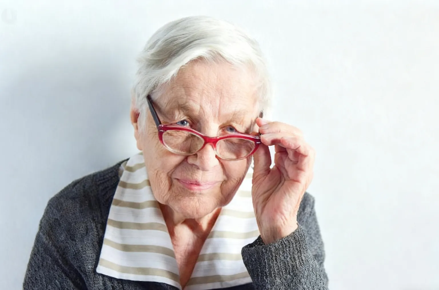
As people age, it is natural for their vision to change. A common condition called presbyopia makes it difficult to focus on close-up objects and small text. This can turn reading a standard watch face or smartphone screen into a challenging task that requires reading glasses. A large font smartwatch is engineered as a solution to this exact problem. It presents information in a size that is comfortable to read without strain, making the device instantly more accessible and useful.
Reducing Cognitive Load and Stress
When text is small or cluttered, the brain has to work harder to decode it. This increased cognitive load can cause stress and frustration, leading many seniors to abandon otherwise useful technology. A large, clear font simplifies the user experience. Information is absorbed effortlessly, allowing the user to focus on the meaning of the message, not the struggle of reading it. This reduction in friction encourages regular use and helps build a positive relationship with the device.
Enhancing Safety Feature Accessibility
Readability is not just about comfort; it is a crucial component of safety. In an emergency, a user needs to be able to read alerts and on-screen prompts quickly and accurately. A large font ensures that a notification for a medication reminder is not missed, or that the confirmation message for an emergency SOS call is clearly understood. This clarity can make a significant difference in the outcome of a critical situation, ensuring that safety features are used correctly and with confidence.
Why a Large Font Smartwatch is Essential in Montréal's Environment
Montréal offers a unique urban landscape, and its seniors lead active, engaged lives. A smartwatch with a large, clear display is particularly well-suited to the city's specific environmental and cultural characteristics, from its bilingual nature to its varied lighting conditions.
Navigating a Bilingual City with Clarity
Montréal is a proudly bilingual city, and many of its senior residents are comfortable communicating in both French and English. A smartwatch used in this environment must present information clearly in both languages. A large font is essential for this. It ensures that accents, characters, and words in both French and English are perfectly legible, preventing misinterpretation of important alerts or messages. This linguistic clarity is fundamental to serving the needs of Montréal's diverse population, making the device truly accessible to all.
Readability in Montréal's Varied Lighting Conditions
A senior's day in Montréal can take them through many different lighting environments. A large font, paired with a bright, high-contrast screen, ensures the watch is always readable.
- Bright Summer Sun: Whether enjoying a festival at Parc Jean-Drapeau or sitting at an outdoor café on a street like Rue Saint-Denis, a bright screen with large text cuts through the glare.
- Overcast Winter Days: The flat, grey light of a Montréal winter can make low-contrast screens difficult to see. A clear, bold font remains legible.
- Artificial Lighting: Navigating the Metro or the extensive Underground City (RESO) means relying on artificial light. A clear display is essential for checking the time or messages while on the move. This adaptability ensures the watch is a reliable companion, no matter the season or location.
Deciphering Information on the Go
Montréalers are active, and seniors are often out and about, whether walking in their neighbourhood, shopping at the Jean-Talon Market, or exploring Old Montréal. In these busy environments, they need to be able to get information from their watch with a quick glance. A large font makes this possible. A senior can easily see the time, check their step count, or read an incoming notification without having to stop, find their glasses, and focus intently on a tiny screen. This makes the device a practical tool for an active urban life.
Key Features of an Easy-to-Read Smartwatch
A truly legible smartwatch goes beyond simply enlarging the text. It involves a holistic design philosophy where every element of the display is optimized for clarity and ease of use.
The Font is Just the Beginning: High-Contrast Displays
Font size is only half the equation. For maximum readability, this large font must be presented on a high-contrast display. The most effective combination is typically bright white or yellow text on a pure black background. This sharp difference between the text and the background makes the characters stand out, reducing eye strain and making the information much easier to read, especially for those with vision impairments.
Brightness and Screen Technology (OLED vs. LCD)
The type of screen used in the smartwatch plays a significant role in its readability.
- OLED (Organic Light Emitting Diode): These screens are often preferred for senior smartwatches. Because each pixel creates its own light, they can achieve a true black background, which dramatically increases the contrast ratio. They are also typically brighter and easier to see in direct sunlight.
- LCD (Liquid Crystal Display): While still effective, LCD screens use a backlight, which means their black backgrounds can sometimes appear grayish, slightly reducing contrast. An adjustable brightness setting is also a key feature, allowing the user to set the screen to a comfortable level for their eyes and environment.
Simple, Uncluttered Watch Faces
A large font can be undermined by a cluttered screen. The best watch faces for seniors are minimalist and purpose-driven. They avoid displaying unnecessary information like weather icons, multiple time zones, or complex health data charts. Instead, they focus on showing only the most essential information in a large, clear format:
- The time (digital is often easiest to read)
- The date
- The battery level
- A step count (optional) This uncluttered approach ensures that the most important data can be read and understood in an instant.
Integrating Safety and Health with Maximum Visibility
The ultimate goal of a senior smartwatch is to enhance well-being and security. A large font and clear display are the gateway to making these features effective and accessible.
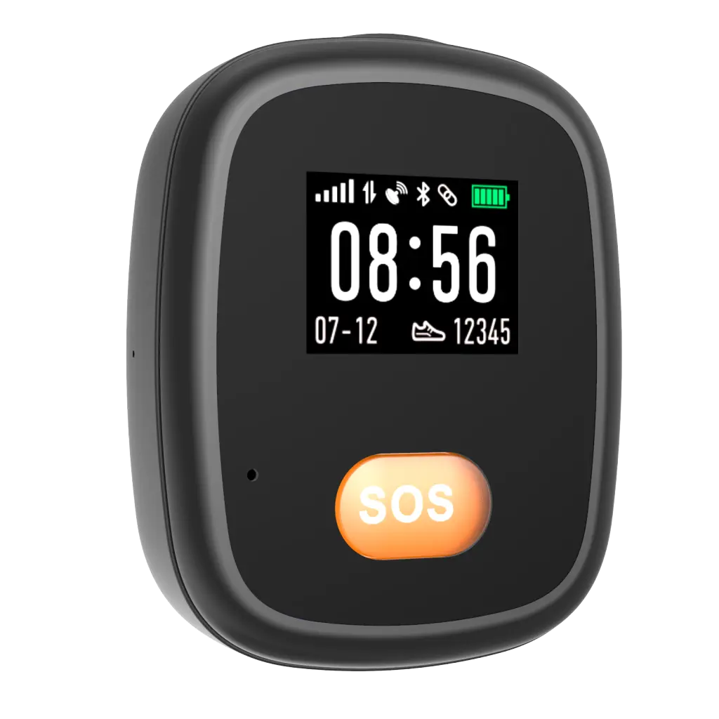
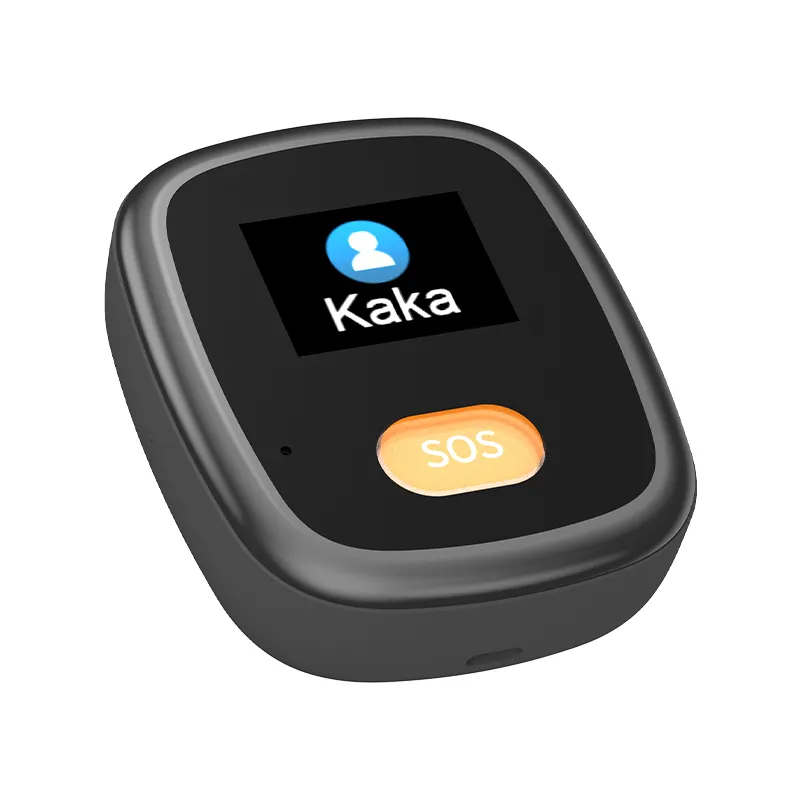
Activating the SOS Button with Confidence
When a senior activates an emergency SOS feature, the watch will often display a confirmation message or a countdown timer. A large, clear font provides crucial reassurance in a stressful moment, confirming that the call for help is being made. This ease of use is just as important as the feature itself, ensuring that a senior watch with an SOS button in Calgary is as simple to operate as one in Montréal.
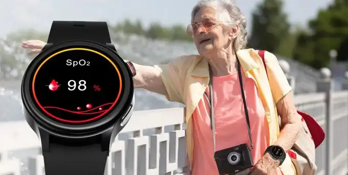
Monitoring Health Data Without Strain
A smartwatch can be an excellent tool for proactive health management. However, if the health data is presented in tiny graphs or numbers, it is unlikely to be used. A large font allows seniors to easily check their daily step count, monitor their heart rate, and read medication reminders. This accessibility encourages them to engage with their health data, turning the device into a true wellness companion. It can function as a highly visible fitness tracker, motivating a healthier, more active lifestyle.
The Role of Readability in Broader Safety
A clear display enhances all other safety functions. For a device that includes automatic fall detection, the on-screen alert must be large and easy to read so the user can cancel it if it is a false alarm. While a dedicated fall detection watch, essential in Vancouver's wet climate, focuses on the automatic trigger, the ability for the user to easily interact with the alert is a universal principle of good safety design.
Beyond the Font: A Complete Usability Package
A truly user-friendly smartwatch for seniors considers all aspects of accessibility. A large font is the visual foundation, but it should be supported by a range of other features that make the device simple and intuitive to use.
Strong Haptic Feedback and Loud Audio Alerts
For seniors who may also have hearing impairments, visual alerts alone may not be enough. Strong haptic feedback (a distinct vibration on the wrist) and loud, clear audio alerts are essential complements. This multi-sensory approach ensures that important notifications, such as incoming calls or medication reminders, are never missed.
An Intuitive, Icon-Based Interface
Navigating a smartwatch should not require reading a manual. A well-designed interface uses large, simple, and universally understood icons to represent its main functions. A large phone icon for making calls or a heart icon for checking health data makes the device easy to navigate for users of any technical skill level, reducing reliance on text menus.
Simple Charging and Long Battery Life
The daily maintenance of the watch should be as simple as its interface. A magnetic charging cable that snaps easily into place is far better than a tiny port that is difficult to see and plug in. This should be paired with a long-lasting battery that can go a full day or more, so the senior does not have the constant worry of their device running out of power.
Usability as a Foundation for Other Features
Ultimately, a focus on usability is what makes all other features possible. The most advanced location tracking or health sensor is of little value if the user cannot interact with the device easily. While a GPS watch for seniors in Toronto provides critical location data, that data is only useful if the entire device package is accessible and user-friendly from the start.
Conclusion
A large font smartwatch in Montréal is fundamentally about empowerment. It is a device designed with the user's needs as the absolute priority, ensuring that technology serves them, not the other way around. By focusing on an easy-to-read display, high contrast, and a simple interface, it removes the barriers that can make modern gadgets intimidating. This clarity provides Montréal seniors with the confidence to stay connected, manage their health, and remain safe while enjoying their vibrant, bilingual city. It is a testament to the idea that the best technology is not the most complicated, but the most accessible. For a complete look at options available, consider the full range of the senior smartwatch in Canada.