Easy-Read Senior Watch Madrid Spain | Simple Design
2025-10-07

An easy-read senior watch in Madrid, Spain, is defined by its commitment to a simple design, ensuring that technology is accessible, intuitive, and stress-free for older adults. In the vibrant and sun-drenched capital of Madrid, clarity is not just a feature; it is a necessity. For the city's seniors ("las personas mayores"), a smartwatch must be effortlessly legible under bright sunlight and simple to operate during a leisurely "paseo" or a busy day in the city. This guide explores why a focus on readability and simplicity is paramount, and how it empowers seniors to stay safe and connected with confidence.

The Core Principle: Why Simplicity and Readability Come First
The success of any piece of technology for seniors is measured by its adoption and consistent use. Complicated devices with small text and confusing interfaces are often abandoned, no matter how powerful their features are. A design philosophy that prioritizes readability and simplicity from the very beginning is the key to creating a truly helpful and empowering tool.
Addressing Age-Related Vision Changes
A primary challenge for many seniors is presbyopia, an age-related condition that makes it difficult to focus on small, nearby text. A watch with a standard display can become a source of daily frustration, requiring the user to constantly search for their reading glasses just to check the time or a notification. An easy-read watch is the direct solution. It utilizes large fonts, bold text, and high-contrast colour schemes to present information in a way that is immediately clear and comfortable to see.
Reducing Technology-Related Anxiety
For older adults who did not grow up with digital devices, new technology can sometimes feel intimidating. A complex interface with countless options and menus can create anxiety and a fear of "doing something wrong." A simple design, centered on a single screen with large icons and minimal text, removes this barrier. It fosters a sense of mastery and confidence, encouraging the user to explore the device's features without fear, which is crucial for the adoption of its life-saving functions.
Clarity as a Foundation for Safety
A senior cannot feel secure with a device they cannot easily understand or operate, especially in a stressful situation. Readability is the absolute foundation of a good safety device. If an emergency alert appears on the screen, the user must be able to read it instantly. If they need to activate a function like an SOS call, they must be able to do so without confusion. A clear, simple design ensures that the watch's safety features are not just present, but are also practical and reliable when they are needed most.
Why an Easy-to-Read Watch is Crucial in Madrid's Environment
Madrid's unique climate and lifestyle make the need for an exceptionally clear and simple watch even more pronounced. The design of the device must be perfectly adapted to the daily life of a "Madrileño" senior.
Conquering the Bright Madrid Sunlight
Madrid is one of Europe's sunniest capitals. While this beautiful weather is a key part of the city's charm, it creates a significant challenge for most electronic screens: glare. A standard smartwatch display can become completely washed out and unreadable under the intense Iberian sun. An easy-read watch designed for this environment must have specific hardware features:
- High-Brightness Display: The screen must be capable of producing a high level of brightness (measured in nits) to overpower the ambient sunlight.
- High-Contrast Technology: OLED screens are superior in this regard, as their ability to create true blacks makes the bright text stand out far more vividly than on a standard LCD screen.
- Anti-Reflective Coating: A special coating on the screen helps to reduce glare, further improving outdoor visibility. This ensures the watch is perfectly legible whether a senior is enjoying a coffee on a sunlit terrace in the Plaza Mayor or taking a walk in El Retiro Park.
Navigating the Metro de Madrid with a Quick Glance
The Metro de Madrid is an extensive and efficient transport system, but its busy stations and complex maps require attention. A senior using the Metro needs to be able to get information from their watch with a quick, simple glance without breaking their stride or needing to stop in a crowded area. A large, clear display allows them to check the time, a message from family, or a medication reminder instantly and effortlessly.
The Importance of a Full Spanish-Language Interface
True readability and simplicity in Madrid are only possible with a flawless, native Spanish-language interface. Every menu, every alert, and every icon label on the watch must be in clear and correct Spanish ("Castellano"). The companion smartphone application for family members must also be fully translated. This linguistic precision ensures there is no ambiguity or confusion, making the device truly accessible to its intended users.
A Perfect Companion for the "Paseo"
The "paseo," or leisurely evening stroll, is a cherished tradition in Madrid. It is a time for relaxation, socializing, and enjoying the city as the heat of the day subsides. An easy-read watch with a simple design is the perfect companion for this ritual. It provides important information and a safety net without demanding constant interaction or creating distraction. It complements a relaxed and sociable pace of life, rather than complicating it.
The Anatomy of a Simple Design: Key Features
A truly easy-to-read and simple-to-use watch is the result of deliberate design choices across both its hardware and software.
The High-Contrast, Large-Font Display
This is the cornerstone of the device. The software should be designed around the principle of "less is more." Watch faces should be minimalist, prioritizing the clear presentation of essential information like the time and date in a very large font. The colour scheme should be high-contrast by default, such as bright white text on a deep black background, to maximize legibility for eyes of any age.
An Intuitive User Interface
The best senior watches avoid complex, multi-level menus. Instead, they use a simple, icon-based user interface. A swipe from the main screen might reveal a few large, clear icons for core functions: one for calls, one for messages, one for health, and one for SOS. This visual, straightforward navigation system is highly intuitive and requires virtually no learning curve.
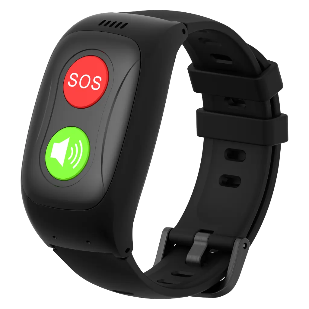
A Single, Tactile Button for Key Functions
While touchscreens are useful, relying on them for critical functions can be difficult for those with dexterity issues. A simple design often includes a prominent, physical button on the side of the watch. This button can serve as a "home" button to return to the main screen or, more importantly, as the dedicated SOS button. A physical button provides tactile feedback that a touchscreen cannot, ensuring the user knows they have activated a function correctly.
Effortless Charging and Maintenance
Simplicity must extend to the watch's upkeep. A charging system with a tiny, fiddly port is a point of failure. A magnetic charging cable that snaps onto the back of the watch is a far superior, user-friendly solution. This, combined with a battery that lasts for a full day or more, ensures that the daily maintenance of the device is as simple and stress-free as its operation.
How Simple Design Enhances Core Safety Features
The primary purpose of a senior watch is to enhance safety. A simple, easy-to-read design makes these core safety features more reliable, accessible, and effective.
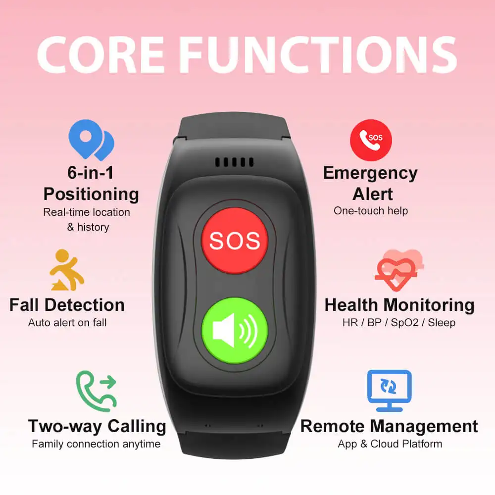
Making the SOS Alert Foolproof
When a user presses the SOS button, a confirmation message or countdown will appear on the screen. A large, bright display ensures this message is clearly seen, providing reassurance that the alert has been activated and giving them a clear option to cancel if it was a false alarm. The confidence to use an SOS watch, as seen in Manchester, UK, is directly tied to the user's ability to easily understand the device's feedback during a stressful event.
Interpreting GPS and Location Data
While the watch's GPS tracks the user's location for caregivers, the simple interface is crucial for the wearer as well. For example, a family member might send a text message to the watch that says, "Mamá, quédate donde estás. Voy a buscarte." ("Mom, stay where you are. I'm coming to find you."). The ability to easily read this message is vital. The need for an accurate GPS senior watch in London is matched by the need to clearly communicate with the user in Madrid.
Interacting with Fall Detection Alerts
Many advanced watches include automatic fall detection. After a potential fall is detected, the watch will sound an alarm and display an on-screen prompt to cancel or confirm the emergency call. This screen must be exceptionally clear and easy to interact with. The technology behind a fall detect smartwatch, a key tool in Germany, is only effective if this crucial user interaction is simple and unambiguous, preventing false alarms and ensuring help is called when needed.
Choosing the Right Easy-to-Read Watch in Spain
When selecting a device for a senior in Madrid or anywhere else in Spain, there are several key factors to consider.
Prioritizing Screen Technology for the Spanish Climate
Given the sunny climate, the screen is the most important hardware feature. An OLED display with a high brightness rating (at least 600-1000 nits) and an anti-reflective coating should be a top priority. This is the only way to guarantee excellent readability outdoors for most of the year.
Verifying Compatibility with Spanish Mobile Networks
For the watch to function as a standalone safety device, it needs a reliable cellular connection. It is essential to choose a service that partners with one of Spain's major mobile network operators, such as Movistar, Orange, or Vodafone, to ensure the best possible coverage throughout Madrid and across the country.
Ensuring Spanish-Speaking Customer and Monitoring Support
From the initial setup process to handling a real emergency, the ability to communicate in Spanish is non-negotiable. Ensure that the company provides Spanish-speaking customer support. More importantly, confirm that their 24/7 monitoring centre is staffed by fluent Spanish-speaking operators who can coordinate with local Spanish emergency services.
Balancing Simplicity with Desired Features
The core principle is simplicity, but modern seniors may still desire advanced features. The trend towards integrated devices, such as a full-featured smartwatch for the elderly in Paris, shows that users across Europe want technology that is both simple to use and highly capable. The key is to find a device where these features are presented in an accessible, uncluttered interface.
Conclusion
An easy-read senior watch in Madrid, Spain, is the embodiment of user-centric technology. Its simple design is not about a lack of features, but about a deliberate focus on what truly matters: clarity, accessibility, and confidence. By prioritizing a large, bright display and an intuitive interface, it provides a tool that is perfectly adapted to the sunlit environment and active lifestyle of "las personas mayores" in Madrid. It empowers them to embrace technology without anxiety, ensuring they can stay safe, healthy, and connected while enjoying their beautiful city to the fullest.